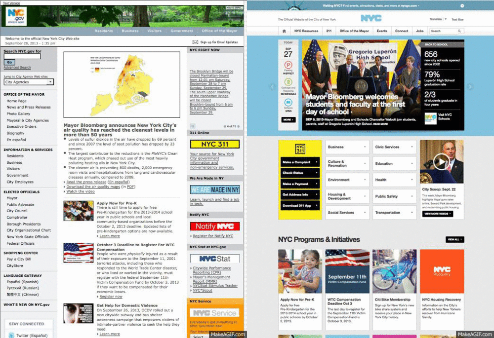
A Look Inside the Redesign of NYC.gov
The New York City government recently completed a major redesign of its official website, NYC.gov. Mayor Michael Bloomberg has been pushing an aggressive digital agenda, which has included the hiring of the city’s first chief digital officer Rachel Haot. The city’s website, which hadn’t been redesigned since 2003, was not mobile-friendly, “nor was it capable of rationally negotiating the more than 100 city agencies that roll up into the site,” according to GigaOM.
To kick off the redesign, the city hosted its first hackathon, an event where programmers and designers get together for a weekend of solving problems, creating and building. In the case of NYC.gov, updating a site with more than 5 million pages offered a real challenge.
The new website offers not only a refreshed look and feel but also a new infrastructure. Prior to the update, natural disasters like hurricanes Irene and Sandy put enormous stress on the aging system. It is now able to withstand surges of visitors. Rahul Merchant, the city’s chief information and innovation officer, recently said that “NYC.gov receives more visitors each year than the combined populations of America’s 10 largest cities.” With more than 35 million unique visitors each year, the site has to be able to handle an enormous amount of traffic.
It’s worth noting that the city’s government did not attempt to tackle this project on its own; they hired NYC-based digital marketing agency Huge to do the heavy lifting.
Check out GigaOM’s excellent piece 5 lessons from redesigning NYC.gov and see the graphic below for a before-and-after look at the website.


